You are currently browsing the tag archive for the ‘I was there’ tag.
Last week I attended a talk (arranged by Skillswap Brighton) on the topic of persuasive design.
This is something of a buzz topic right now- from the ubiquity of Cass Sunstein’s Nudge (winner of my “desk-furniture for planners award 2009”), to the emergence of the Persuasive Technology Lab at Stanford University, to the biggest advertiser in the UK‘s newly-stated ambition of ‘behaviour change’- it concerns bypassing the traditional ‘change-attitudes-first’ model of communications and going straight for the behaviour jugular by influencing an individual’s decision-making apparatus without necessarily engaging their conscious mind. A lot of this stuff builds upon the still-awesome exploration of human adaptation to environments in Jane Fulton-Suri’s photographic essay ‘thoughtless acts‘.
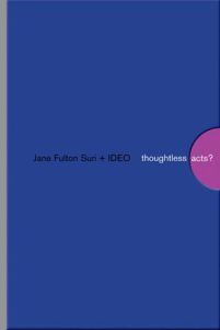
One of my favoutite books, that is.
The speaker I went to see was the fresh-faced Dan Lockton, a research student at Brunel University who has achieved no small measure of fame already for his compelling work in this area. His contribution to the field is the Design with Intent Toolkit (free to download and experiment with) which helps to stratify the various ways in which designers can influence people’s behaviour whether by ‘enabling’ choice (making an option more attractive by making it easier than alternatives) or by constraining choice (the opposite – think park benches that are designed to discourage people sleeping on them).
Here he is, giving the very talk I witnessed:
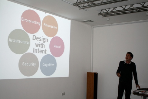
He also has a knack of coming with rather good analogies – particularly for design that failed to understand the behavioural ecosystem it exists within.
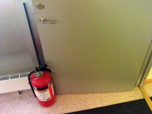
One I particularly liked was the vision of a fire door propped open by a fire extinguisher.
Anyway, the Design with Intent approach is very interesting and I think enormously relevant to any communications practice in this day and age when everything is media, and the practise of embedding communications thinking in products, services, interfaces and interactions becomes ever more important.
Here’s an example image of one of Lockton’s Design with Intent Toolkit‘s ‘lenses’:
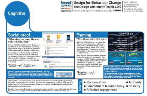
These various ‘lenses’ are used to provoke a myriad of possible design solutions to a particular behavioural problem.
The example he used in the talk was the problem of household energy consumption, where behavioural ‘decisions’ (or more correctly, non-decisions) account for somewhere in the region of 26-36% of usage. Kettles, for example, are routinely overfilled- even for the purpose of making a single cup of tea. This is a behavioural norm that is harmless routine at the level of the individual, but that has extreme and problematic ramifications at the state or global level.
So what’s the solution?
Is it a ‘2.0’ style social interface that uploads your kettle-data to the web and automatically compares and contrasts you with your neighbours, fellow citizens or global best-users?
Or is it a plastic filter that automatically shuts after 1 mug’s worth of water is detected?
Or is it a signalling system employing emoticons to provide a timely feedback loop at the point of filling?
We don’t know yet – but the point of this research is to generate enough good, different hypotheses to test, and then report back on the findings, because whilst it presents a very challenging design brief, reducing home energy consumption is at least easy to measure.
At the time of writing, Dan’s talk hadn’t yet been uploaded as a podcast, but I’m sure you’ll be able to find it here soon. In the meantime, there’s plenty of other interesting talks to peruse – big thanks to Skillswap Brighton for a thoroughly stimulating evening 🙂
Images sourced from event organiser boxman on Flickr, from Andreas Kirstensson on Flickr, and from Dan Lockton’s site
Whilst enjoying the excellent Anish Kapoor – curated Brighton Festival this month, I’ve managed to poke around some artists’ “open houses” (most have lovely bathrooms), see a whole bunch of strange street performances, some hit-and-miss installations and a shed load of live music at the truly wonderful Great Escape festival.
One of the more off-piste projects I encountered during this period was Victoria Melody’s “The Demographic of a Pigeon Fancier”.
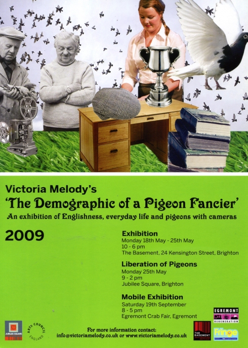
As the flyer says the exhibition was very much about Englishness, and by taking a very specific route into the topic (namely, the fading northern institution of pigeon racing) it seemed to succeed in bringing some of the more universal associations and connotations of ‘Englishness’ to light.
The installation consisted of a number of different elements.
The first, and most striking, was a hypnotic ‘pigeon-cam’ video projected onto the wall of the gallery opposite the entrance. Everyone who entered the exhibition stood, transfixed for some moments by the simultaneously familiar and alien viewpoint the film showed.
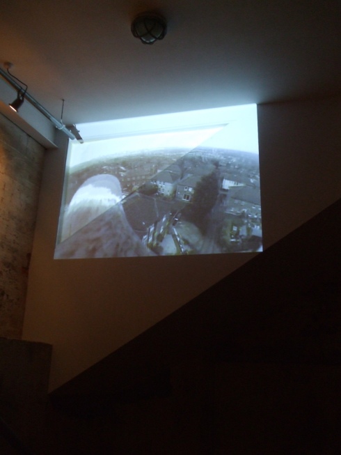
There was something clever about this – the fantasy of flight, of freedom as represented by seeing from a truly bird’s-eye view was successfully rendered smaller, mundane and mean by both the status of the bird itself (pigeons are generally regarded as flying vermin in London and the South) and the spectacle of the landscape it held lofty dominion over; characterless suburban semis with neatly enclosed gardens and garages, all smothered by the leaden blanket of an English sky.
Once you descended fully into the gallery space, you were faced by two suspended nests of handwritten parcel tags. One of these ‘nests’ was composed of messages sent via homing pigeon from people in Cumbria addressing ‘southerners’ in general – including pearls like the one captured below:
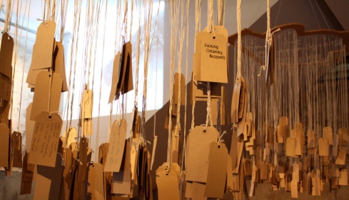
The other nest was composed of messages written by people in Brighton addressed to inhabitants of ‘”the North” in general, and visitors were invited to record their thoughts on a blank tag with the promise that it may be included on the pigeons’ return trip to Cumbria at the end of the exhibition. The tags, and the functional hardwood shelves that housed them, were also deliberately reminiscent of another, even more rapidly fading English institution, the local Post Office.
The far wall of the gallery was covered in newspaper clippings, letters and photographs gathered by the artist during her extended tour of the North where she spent her time documenting the lives of England’s forgotten fanciers.
Adding depth to this material were 3 close-cropped talking-head documentary interviews, installed so that the monitors displaying the films served as the heads and faces of a tableaux of three stereotypical pigeon-fancying mannequins – all dressed up in flat caps and body-warmers with pies or pints of bitter clasped in plastic hands. These films played alternately, often freezing mid-sentence as another of the mannequins took its turn to speak about the decline of their 10,000 year old tradition.
Something about the gallery setting, and the genuinely thoughtful way in which the artist had used the space made this really feel like a trip into a different England; a place far removed from Brighton’s metropolitan sensibilities and somewhat mired in the past- but at the same time retaining a strong sense of pride and a surety of identity that is notable by it’s absence down here.
It was fun, interesting, thought-provoking and kind of sad all at the same time, and probably my favourite thing from the festival this year.
Sadly, I missed the liberation of the homing pigeons that took place at 10:00am on bank holiday Monday – I was in bed with a hangover- and am still eagerly watching Flickr for some photographic evidence of the event.
So far I have found an image of some specially bred fancy pigeons sitting in Jubilee Square waiting to be set free…
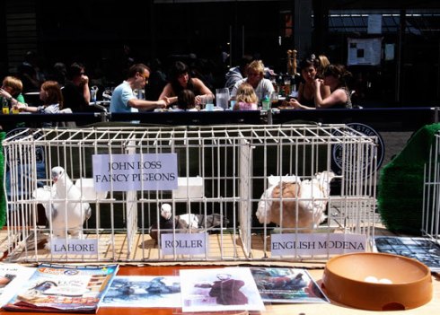
… if you saw it and have a photo, please send me the link – thanks!
PS if you want to know what I sent to our friends in the north, either dm me @smimarchie or send a homing pigeon 🙂
Images sourced from Flickr users hotchilicat, melita_dennett and fred pipes
So a few weeks ago I went to see Brian Eno have a conversation with his friend Jon Hassell as part of the South Bank’s Ether festival. I was going to write it up, but I actually think it’s probably more interesting (and less work) to just post the hurriedly-typed notes I made in-situ.
The stage was dominated by a giant screen that showed the table top the two men had arranged their stimulus on in massive scale- whether live scribblings, images or pages from Eno’s notebook.
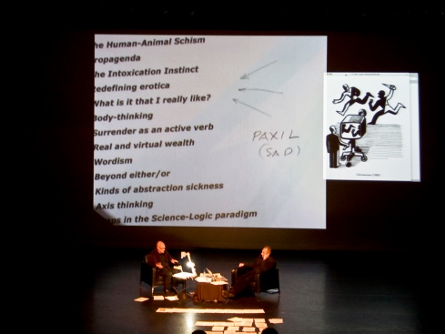
It was a broad, wide- ranging chat, but stayed within the realms of the type of things Brian Eno normally talks about- the weird sex stuff was all from Hassell, who I thought was a bit of a waste of space conversationally (maybe this is unfair – he just seemed to keep taking the dialogue into less interesting places as far as I was concerned).
Anyway, this is my record of the two hours:
“Stop moving the ohp! Not just about making attractive things, creating new worlds Systems + structures, music as a metaphor for collaborative society ‘Surrender’ a choice vs control Surfing, bridge building Human history is the surrender zone 4 areas: art, sex, drugs, religion Not me, us, the flow The north owns broadcasting (most powerful technology) an ideology of survival Science makes opposites that are false Media pipeline is narrow, demands caricature Is there always a valid opposite opinion? Culture of agument Elevate the nutter Geometry makes equal makes opposite- these are abstractions_ misleading when applied to human affairs Anus- wordism- desire to control by fencing language Drug companies- inventing illnesses, not cures (paxil) Creating by naming (WMD) propagenda What exists before language? Is weird sex marginalised when it should be lionised? How much is universal? Porn does not equal happiness, equals alienation Pleasure is evolution’s compass- now we’ve virtualised it Scale effect- a qualitative as well as a quantitative effect. All political systems work well on a small scale Intrinsic/conferred value There is no reality referred to in the credit crisis- it is a belief system that propagates itself- conferred value is easily unconferred, intrinsic value is not Art is all about conferring value (creates something from nothing, is ephemeral) Most art loses value We are mixed up Gold moves between real and abstract Nearly everything happens in the middle ground, not at the poles What is it that you really like? Wanking as surrealist art Art is valuable because its harmless Eudemonic criteria Navigating possible worlds It exists because it’s non verbal Charts are v useful! Being blown off course- haircuts Real information in cultural choices Dialectic between control/surrender Religion is like classical music- an attempt for ecstasy” Read the rest of this entry »I was in San Francisco last month. It’s really a little depressing that I’m not still there now. It was beautiful and hot- see?
Mmmmm… ice cream sherbet…
Anyway, I’m drafting a different post to round up all of the brilliant things I saw while I was there. This post is meant to single out one particular event for special bloggy attention; the 2008 SECA award at the San Francisco Museum of Modern Art.
SECA is an acronym that stands for “Society for the Encouragement of Contemporary Art”; a local art interest group that bi-annually selects four local artists worthy of special attention and features them in an exhibition at SFMoMA. This year, the recipients were Trevor Paglen, Desiree Holman, Tauba Auerbach and Jordan Kantor.
Charlotte and I were just really lucky that this exhibition was on, as we stumbled into the gallery with no plan and only an hour until closing time (for anyone who can feasibly get there it runs until May 10th). Apart from Trevor Paglen who has achieved relatively substantial web-fame, I didn’t have prior knowledge of any of the exhibited artists; a fact of which I’m now ashamed as this was a thought-provoking and entertaining exhibition, choc-full of great work.
The aforementioned Paglen is probably best known for his photographic project ‘The Other Night Sky‘ where he meticulously locates, ‘captures’ and identifies classified US surveillance satellites as they orbit the earth. The image below exemplifies this series of works, which look like they could’ve been liberated from the pages of an issue of National Geographic.
Without the context supplied by their titles, these images appear to be well-crafted yet essentially innocent time-lapse photographs of celestial bodies. They look like nature photographs, and they evoke the appropriate set of associations and responses as a result (the sense of awe, the sense of one’s own inconsequence, etc) until the works’ titles- which are literal, scientific, flat and factual- impinge upon the reverie.

Four Geostationary Satellites Above the Sierra Nevada
These are not marvels of nature, but man-made machines. Machines with a purpose.Machines constructed here on earth and forcibly blasted into orbit by millions upon millions of $$$ worth of political and military will.
Moreover, they’re machines that you’re not supposed to know about.
The image hanging on the gallery wall is a mute witness to countless hours of investigative effort: contacting amateur ‘spotter’ communities, matching sightings from enthusiasts all over the planet, building mathematical models of prospective orbital paths, eventually identifying a space and time window that might yield a photographic capture.
It is this effort that the art work – that Paglen’s whole practice, in fact- is really concerned with: the surveiling of the surveilors. The fact that the images recall the conventions of nature photography serves to make their tortuous back-story all the more sinister.
Paglen’s other project featured in the SECA exhibition is Symbology, which documents the rich visual language of ‘black operations’ in the US military. Given that the projects, places and departments immortalized in this work do not officially exist, these meticulously collected decorative patches (displayed single-file in one long horizontal frame) are a strangely kitsch physical remnant of an unknowable world.

They are surprisingly decipherable, demonstrating camaraderie, bravado and no shortage of black humour. They could be doodles on a schoolboy’s notebook.
They are all the realer for it – unexpectedly characterful, human and mundane where they ought to be secretive, obscure and glamorous. It is this supreme recognisability that unsettled me – their surfeit of everyday-ness seemed to crystallize a hard and frightening reality from the realm of playful, enjoyable conspiracy theories and harmless TV drama paranoia. These little objects are powerful- physically and culturally real in a way the sealed manila folder of popular imagination ever could be.
Desiree Holman was only showing one work, The Magic Window. This mixed media installation was a playful (if a little creepy) meditation on the role of Television in creating and fulfilling popular fantasy.
The centrepiece of the work was a video triptych. The centre panel was blank when we first walked in and sat down. The flanking panels each featured a roughly-assembled stage set designed to resemble the living room of a well-loved sitcom family; that of the Connors from Roseanne on the left, and that of the Huxtables from The Cosby Show on the right.
In each set, actors wearing masks went about enacting typical interactions between these familiar characters: on the right, ‘Cliff’ and ‘Theo’ engaged in horseplay with a basketball, whilst on the left ‘Roseanne’ sat on the sofa, chatting to ‘DJ’ as ‘Darlene’ moved about the room.
What was immediately striking about these films was the deliberation with which Holman drew our attention to the artifice – to the tell-tale exposed edges of her representation. Her sketch of the ‘Roseanne’ mask below, clearly shows its ‘mask-ness’ as well as being recognisable as Roseanne Barr – as others in the gallery noted, the masks are more than a little reminiscent of Tobe Hooper’s Texas Chainsaw Massacre.
The same attention to lack-of detail was true of the sets the action took place in.
Click on the image for a video clip:
Holman seemed to want us to buy in to the fiction, but at the same time remain always aware of her purpose- her presence in the re-staging of these familiar (yet warped) scenes.
Soon enough, the two families invade each other’s worlds (oddly recalling the Run DMC/Aerosmith ‘walk this way’ video) and wordlessly interact via hand gestures and the domestic ritual offerings of cookies. Subsequently, the central panel of the triptych comes alive- showcasing a bizarre ‘third space’, a sort of space disco where the characters dance together in jerky, awkward rhythms to a pounding electronica track- whilst glowing green.
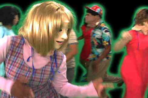
It was pretty odd.
At the same time however, it was interesting and entertaining: the blending of these two sitcoms that both dealt with different forms of social prejudice in their different decades seems obvious in hindsight. Also, highlighting the role-play that takes place in family relationships (which also provides the dramatic impetus in sitcoms) via the donning of masks seemed to me to be asking more profound questions than the pantomime performance initially suggested. In its deliberately rough-shod presentation it referenced the DIY video aesthetic of Youtube, an important platform for video art and as prevalent a force in popular culture as each of these sitcoms were in their respective heyday.
Tauba Auerbach seems to be an artist fascinated by systems, whether visual, mathematical or cultural. I thought her work was completely brilliant.
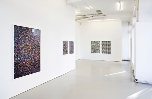
This image shows some pieces from a series dealing with Auerbach’s interest in randomness, particularly the difficulty associated with simulating randomness through algorithms. She has created a whole series of images of Television static – analogue noise that at first glance appears random, but when captured in a photograph…
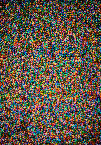
…actually contains patterns. Patterns which can be extracted and made into beautiful, decorative works in artistic media like paint…
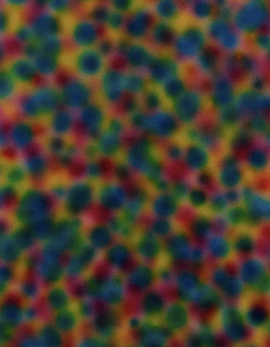
…or through printmaking techniques like this aquatint:
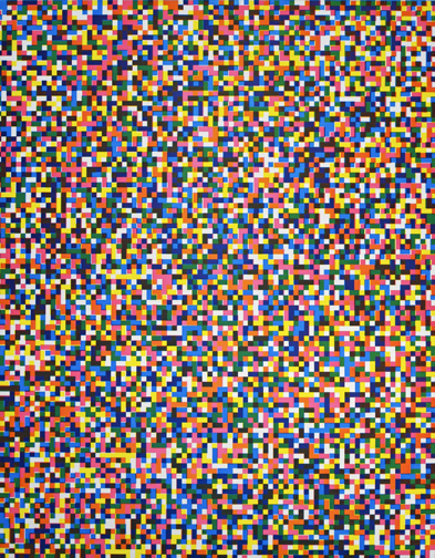
which are the antithesis of randomness – deliberate, precise and authored.
Another series also on display featured her various experiments with language; interrogating the alphabet as a visual system (as in The Whole Alphabet, from Centre Out, Digital V below) or playing with anagrams, letter subtraction games and the physical appearance of letters to highlight the essential ambiguity of these fundamental components of our culture.
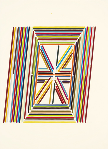
If you’re interested, the exhibition catalogue is available here, and Tauba Auerbach’s “50/50” book can be ordered here. Trevor Paglen has books to sell on Amazon.
Sadly, my rather lengthy enjoyment of Paglen, Holman and Auerbach’s work meant I had somewhat less than 5 minutes to look at Jordan Kantor’s stuff. I’ve got nothing to say except that he seemed to borrow more than a little from Gerhard Richter – but in an obviously deliberate way.
Anyway; a really great exhibition in a really great gallery. Also, if you are inclined towards podcastery, SF MoMA makes a generous amount of the audio guides to its exhibitions available for downloading, which aside from being edifying, can be used very effectively to transport oneself out of London bendy-bus hell to a calm, white-walled gallery of the imagination.
All images were sourced from the artists’ websites

I apologise for the lack of posting over the last 10 days or so.
I have got pretty good excuses (I’ve been moving house, which has been a 24-hour concern for the last few days, and I currently have no internet connection), but they don’t count for much when your last post signs off with a cheery ‘see you tomorrow’ and a smiley face.
So I over-promised and underdelivered – a pretty common and basic misdemeanour that comes with the blogging territory as I understand it.
Anyway, to prove I have some shred of integrity, I will finish the series of Lost-related posts (the new series has already started with a bang btw – who expected to see the ‘big boss’ turn up as a snotty youth on the wrong end of a drubbing by the Lockemeister?) and will try to resist rash declarations about impending installments in future.
I am sorry.
In other news, the Tellier gig I went to instead of watching the Lost series opener was awesome. Here is an appalling photo I took myself:
His sound so perfectly captures the promise of the 1980’s – not just the syths and the phase shifted guitar solos but the drama and the overblown significance of every chord change.
Whilst the whole thing is deliciously ironic it’s also sincere and yearning at the same time- an affectionate ribbing that becomes an embrace. That whole Daft Punk thing, the blurring of the line between parody and homage, wide-eyed sincerity and knowing wink is something I really like – because they’re actually both just points on a continuum of appreciation and because I remember the era they fetishize well myself.
Anyway, the gig was great because whilst the music achieved some of the brooding, melodramatic and overblown qualities of some truly great ’80s moments- I’m thinking of Near Dark and Precinct 13 here- it also totally recalled this for me:
which is quite something.
More proper posting in the near future.
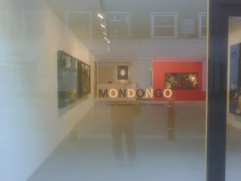
Last week I managed to find 10 minutes to poke my head into the Maddox Arts gallery near Bond Street, as they were hosting the first UK exhibition of Argentinean enfants terrible Mondongo.
Seems like the things you need to know about Mondongo (who are 3 young collaborators) are as follows:
- their name refers to a type of Latin American stew made from tripe
- they employ unusual media, particularly plasticine and fur, to create their striking images
- they are favourites of Comme des Garcons owner Rei Kawakubo
I have to say that while I enjoyed my whistlestop tour, I didn’t leave feeling particularly bowled over.
There is definitely enjoyment to be gleaned from seeing what are huge, technicolour images break up into many hundreds of squiggly lumps and clumps of string, matted hair and plasticine as you move closer toward them.
I like the idea put forward in their manifesto that through mixing up a ‘cauldron’ (as they call it) of commonplace, lowest-common-denominator products as their medium, Mondongo are trying to somehow capture or distil the rudeness, cheapness and lurid texture of everyday life in a ‘medium = message’ kind of way.
And let’s not be churlish- they demonstrate some real virtuoso skills in just compliling these things. This cat’s face (a detail from a huge ‘painting’) is just brilliant:
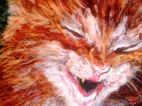
from Eloi Eloi Lama Sabachthani (2008)
You can see how engaging with the medium itself is essential to the experience of viewing one of these works by looking at the different levels of detail in the massive diptych Alone Again.
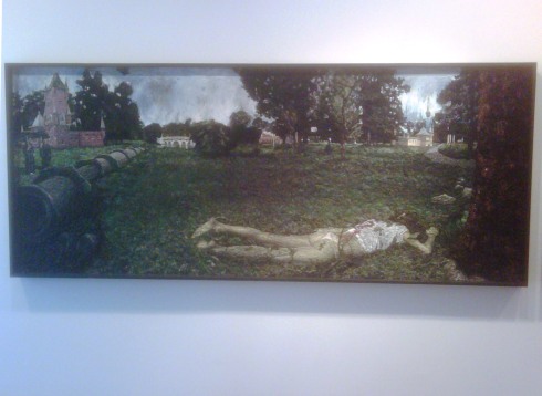
From a distance, this image depicts an apparently decomposing corpse lying face down on the grass in an imaginary European landscape, complete with an oil pipe-line and thickly-rendered Van-Gogh trees.
When you move in closer, you can see that the individual ‘pixels’ making up the rich tapestry of the image have their own figurative function. The photo below shows the area in the bottom left of the image, just to the right of the oil pipe-line:
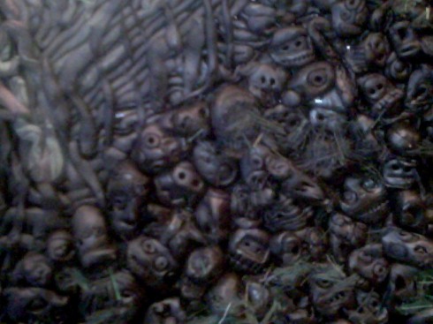
detail from Alone Again (2008)
The earth itself is a character in the narrative of this tableaux- a seething sea of disembodied heads with bared teeth and ghoulish expressions make up the ground on which the subject lays, appearing to be complicit in whatever tragedy occurred here.
Whilst I enjoyed all this, the exhibition never seemed to move out of second gear for me. The images were undoubtedly striking, and the skill with which the artists had composed them was truly impressive; it just felt a little lightweight.
This may be unfair (because I saw the images used in promotional material for Comme des Garcons before I actually made it to the exhibition) but the works felt to me like they were made for advertising. They felt a bit contrived to me – designed to be ‘edgy’ and transgressive without really breaking any really meaningful rules or having anything much to say. The twisted-fairytale idea (libidinous red riding hood flashing a leering wolf) felt perfect for a Diesel campaign or a Vice magazine spread. Sex, pornography and images of death are not exactly new subjects to bring into a gallery, and whilst Mondongo have definitely found a unique voice they don’t seem to have an awful lot to express with it at the moment.
Also, for some reason it bothered me that whilst the figures in Eloi Eloi… and the mass of breasts making up a young girls face in Mamman were provocative and sexualised, a huge image of floating infants was very careful to structure it’s composition so that no rude baby bits were exposed. It seemed to strike a false note, undermining the rest of the exhibition, as if the artists had second-guessed themselves or suddenly gone all prudish.
Anyway, I would heartly reccomend a look at their website because the images there really are impressive, and beautifully photographed (unlike those posted here).
Here’s an example:
I’ll take a proper camera next time 😦
I don’t make a big thing out of it (naturally) but I happen to hold a first-class degree in History of Art.
(Interestingly enough, I know of at least two other History of Art graduates also employed in the world of media strategy- an opportunity the rather inadequate careers department at UCL should probably include in their very thin folder of potential careers for directionless graduates.)
Anyway, when I came out of college – back in 1998- I was heartily sick of Art.
I’d spent three years reading and studying all sorts of theories; from formal analysis to feminist and queer theory to psychoanalysis to class struggle to semiotics to economics and back to formalism again, and had started to percieve the whole thing as a house of cards. It was the year of sensation at the Royal Academy, which was a pretty good metaphor for how I felt about the whole subject- it all seemed vacuous, overtly concerned with the market and fascinated by it’s own cleverness. I pretty much wanted nothing more to do with it.
Anyway, over the last few years I’ve experienced a bit of a rennaisance (l0lz) regarding Art, largely down to the sterling work of Regine and her incomparable site, and Brighton artists Blast Theory.
I’m enthused again, and I’m enthused because the way that artists think of and utilise the media that I work with every day are so much more vibrant, so much more necessary and so obviously more concerned with how people live than the ubiquitous blandishments of the advertising community (and the meta-industry of consultants/journalists/authors on which it thrives). Seeing artists work with with digital media has helped me to see it afresh, and see possibilities I wasn’t seeing before. Which is what art should do, I suppose.
Whether it’s creating a ‘dislocative tourism agency‘ to connect physically and culturally disparate cities, or designing an alarm clock that mercilessly exploits social-connectedness to create powerful new incentives to get out of bed, it is thrilling to see digital media being employed with such an innate understanding of how it fits into people’s lives and such fertile, curious and fearless imagination.
As far as I can tell, the future of media is not being nurtured within media companies of any stripe- be it Nokia or The New York Times. In my opinion it is most definitely being imagined at the RCA, in Portslade and in myriad warehouses, co-operatives and studios the world over.
Anyway, seeing all this wonderful stuff that seemed to ‘get’ media in a manifestly different way to how I’d been seeing it actually got me excited about artists again – about how and what they think. It got me excited about going to see exhibitions again.
In fact, I got so excited about all this stuff that I actually presented a slide about Wim Delvoye’s Cloaca project to the company’s UK sponsorship department for FIVE WHOLE MINUTES.
This was perhaps ill-advised.
Nonetheless, I have regained a passion for seeing Art again, primarily because it helps me to think in a less-trammelled way about how things are or might be or might have been. So in a long and rambling manner, I thought I’d post about some of the stuff I’ve seen recently (towards the end of last year) that got me all hot and bothered: the Domestic Appliance exhibition at Flowers East in Shoreditch and the Heart of Glass exhibition that was part of Concrete and Glass, also (surprise surprise) in Shoreditch.
First up, Domestic Appliance.
I actually got to see this as part of our frankly kick-ass strategy team ‘awayday‘. What I loved about this – apart from all the great exhibits- was the fact that none of my colleagues realized that the stuff they were looking at spanned decades of artistic production. The excitement and playfulness of the exhibition had rendered studying the little plaques on the walls irrelevant. The objects themselves were enough; the curator’s vision defeated the audience’s impulse to try and ‘own’ the exhibits by naming and categorising them into some sort of taxonomy. Domestic Appliance wasn’t an edifying lecture on the canon of kinetic art, but rather a brief glimpse of the weird and wonderful other lives of the objects inhabiting our homes – a Toy Story for grown ups who like their fairytales a little askew.
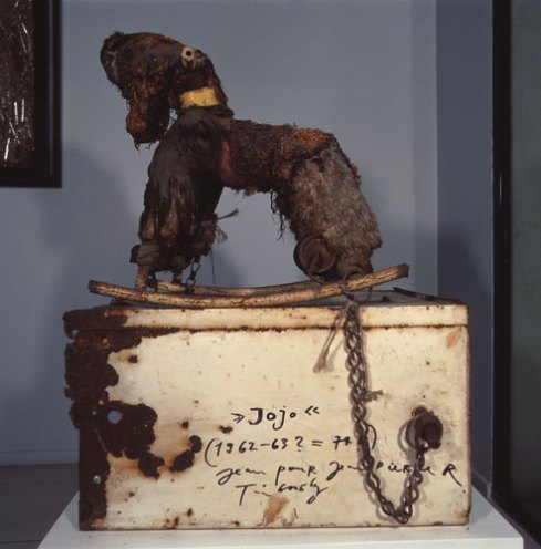
Jean Tinguely’s Mouton, the scariest and most deranged thing on show (like a little piece of Silent Hill somehow existing in Hackney) was from 1962:
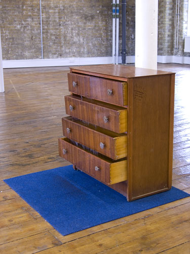
Theo Kaccoufka’s quietly obscene Fountain dated from 1994:
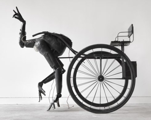
And bringing us bang up to date were Tim Lewis’ bewithching, gracefully moving (and heavily photographed) Pony…
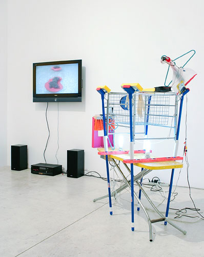
…and Ian Burns’ The Way We Know It – Surrounded Islands (Version 1) – Keep it clean and organized which created a sense of drama by using live audio/visual feeds to magnify the changing light that was being reflected onto a tiny diorama of found objects.
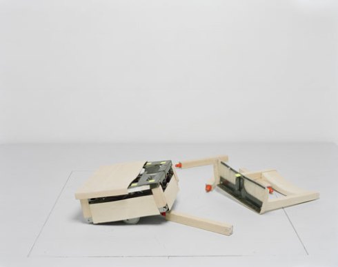
A special mention also has to go to Max Dean, Raffaello D’Andrea and Matt Donovan’s Robotic Chair which held audiences rapt as it repeatedly assembled and disassembled itself. The BANG it made when losing it’s limbs made me jump at least three times.
A fantastic way to spend a few hours and a powerful hit of mental wasabi for me.
Right, now onto Heart of Glass.
I actually got a ticket for the Concrete and Glass mini-festival by entering a competition via email on the opening day (w00t, go me)- which meant I couldn’t find anyone to go with me, of course.
As a result I skulked around, smoked cigarettes to look less lonely (pathetic) and went home waaaay before TV on the Radio got started.
Nonetheless, one of the things I did manage to do was visit the brilliant Heart of Glass exhibition in the creepy basement of Shoreditch Town Hall. I’m not sure whether it was this awesome setting, or the head-rush from the fags, but I had a really fantastic time exploring the nooks and crannies of this impromptu gallery.
The exhibition was also a competition – one lucky artist of those exhibiting would be awarded the prize of a solo show at next years event. For what it’s worth, my highlights included Alistair Mcclymont’s The Limitations of Logic and the Absence of Absolute Certainty, a swirling shifting tornado of water vapour that would repeatedly coalesce into a powerful, visible form and then become loose and unstructured again. It was like a ghostly apparition, moving in a natural and yet weirdly unnatural way that seemed brilliantly otherworldly in the dilapidated dark setting.
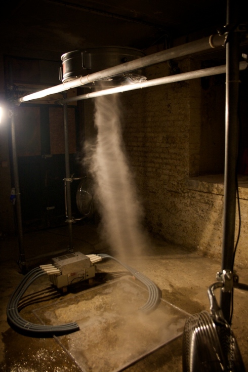
There’s a video of it doing what I was trying to describe here.
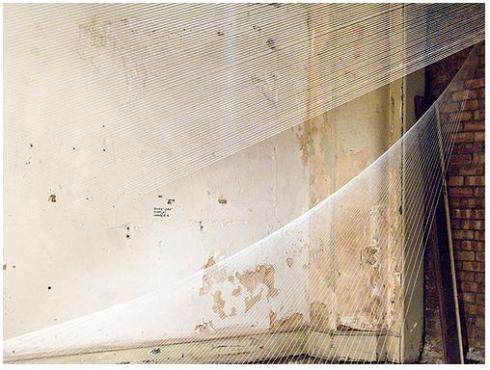
I also loved Kate Terry’s Thread Installation #19, another work that visitors felt compelled to move through and around, the lines of thread changing from visible to invisible depending on your relation to the light source. It’s geometric beauty seemed to come from the digital realm – something created by an algorithm rather than by an artist fastening resolutely analogue thread to tacks hammered into the walls. The smoothness and regularity was thrown into sharp relief by the crumbling walls and dirty, sandy floor of the room that housed it.
Paul Archard’s Horseplay was unsettling, in a slightly-scary-fun sort of way.
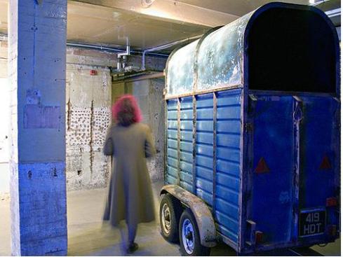
The horsebox dominated the low room in which it was diplayed. People (me included) attempting to peer in were unnerved by the powerful, reverberating sounds of a stallion’s breathing- and left with the sense that the box could hardly contain it’s inhabitant. Every three-minutes or so there would be an explosion of whinnying and snorting that made the box shudder and shake, giving everyone a start. It created a genuinely physical response from those milling about the room, and is a great example of a ‘site-specific installation’ properly doing what it says on the tin.
Lastly, my personal favourite was Kate MccGwire’s Vex.
Caged within a victorian curiosity cabinet, it was a kind of stuffed nightmare- a mutant mess of serpent and bird, sinuously turning in on itself.
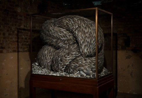
Up close the individual feathers (gathered over a period of months from London pigeons) made attractive (pretty, even) patterns and yet backing away from the thing, I felt disturbed by it, but never able to take my eyes off it.
Compelling stuff, and worthy of winning I think.
I feel a bit sad posting about these exhibitions given that they’re both over. However, if you happen to stumble across a mention of any of theses artists or works featured in an exhibition near you I reckon you could do a lot worse than checking them out.

